Mar 27, 2026
What is the difference between official train websites and booking platforms in Italy
What is the difference between official train websites and booking platforms in Italy? When planning a train trip…
Read MoreIn the world of travel blogging, authenticity and aesthetic appeal play crucial roles. At Railclick.blog, our focus is on embracing the captivating allure of train journeys across Europe. This blog aims to merge a high-end literary magazine feel with contemporary travel discovery interfaces, creating a unique platform for avid travelers and readers alike.
Railclick.blog is designed with a warm beige and sand color palette that promotes calmness and inspiration. With generous use of white space and a structured grid layout, readers can navigate effortlessly through a myriad of content. The combination of elegant serif typography for headlines and clean sans-serif body text offers a harmonious reading experience.
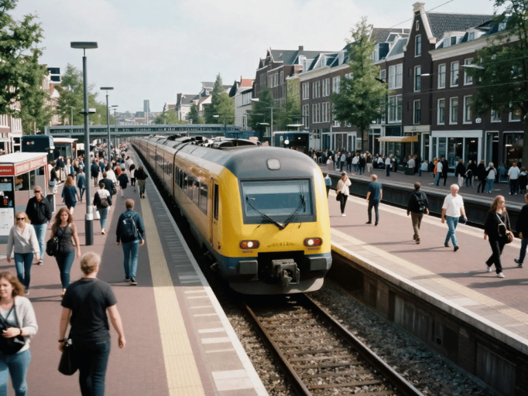
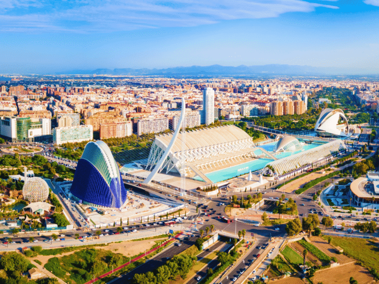
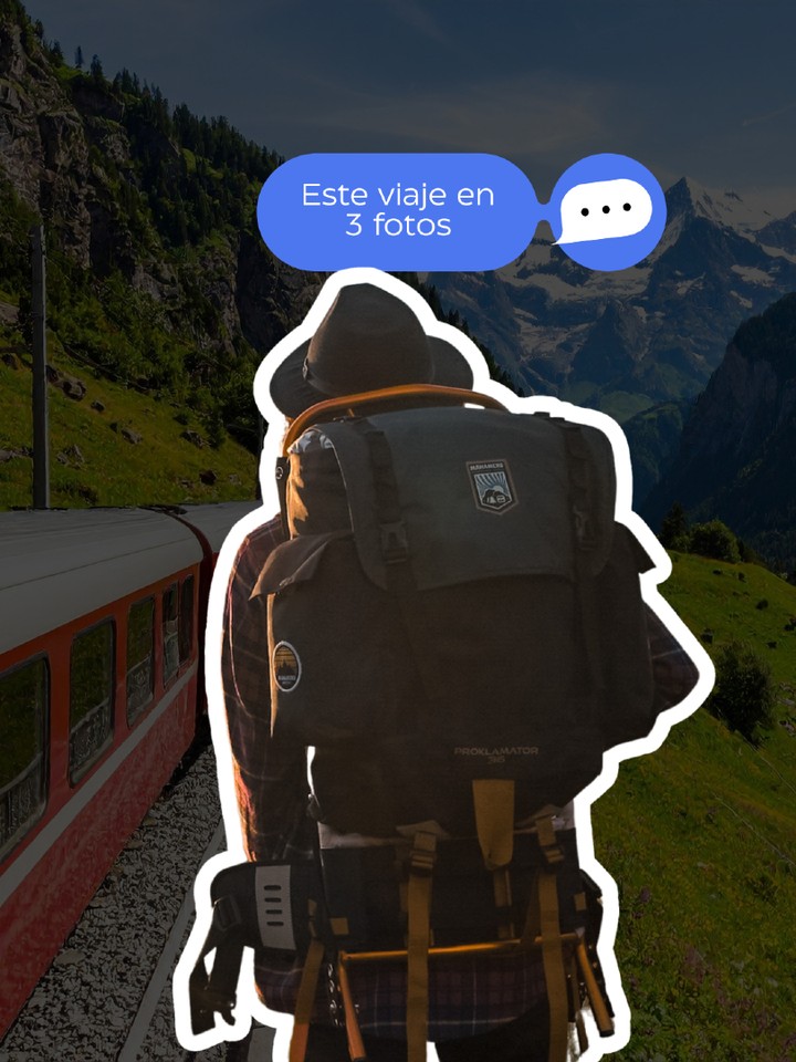
To evoke a sense of slow travel, our hero section features a thoughtful traveler’s portrait, beautifully integrated with stunning photography of train journeys, scenic landscapes, and vibrant European cities. The layout not only feels refined but also engages users by offering destination cards, curated train journeys, and editorial blog posts that encourage exploration and contemplation.
With muted orange accents for call-to-action buttons and minimal yet expressive icons, the overall design of Railclick.blog is intended to resonate with modern European travel culture while providing clarity and trust. This creates a digital haven for those who appreciate the beauty of movement and the stories that unfold along the tracks.